数据科学- 绘制线性函数
运动手表数据集
看看我们的健康数据集:
| Duration | Average_Pulse | Max_Pulse | Calorie_Burnage | Hours_Work | Hours_Sleep |
|---|---|---|---|---|---|
| 30 | 80 | 120 | 240 | 10 | 7 |
| 30 | 85 | 120 | 250 | 10 | 7 |
| 45 | 90 | 130 | 260 | 8 | 7 |
| 45 | 95 | 130 | 270 | 8 | 7 |
| 45 | 100 | 140 | 280 | 0 | 7 |
| 60 | 105 | 140 | 290 | 7 | 8 |
| 60 | 110 | 145 | 300 | 7 | 8 |
| 60 | 115 | 145 | 310 | 8 | 8 |
| 75 | 120 | 150 | 320 | 0 | 8 |
| 75 | 125 | 150 | 330 | 8 | 8 |
在 Python 中绘制现有数据
现在,我们可以首先使用 matplotlib 库绘制 Average_Pulse 与 Calorie_Burnage 的值。
plot() 函数用于制作点 x,y 的二维六边形分箱图:
实例
import matplotlib.pyplot as plt
health_data.plot(x ='Average_Pulse',
y='Calorie_Burnage', kind='line'),
plt.ylim(ymin=0)
plt.xlim(xmin=0)
plt.show()
实例解析
- 导入matplotlib库的pyplot模块
- 绘制来自 Average_Pulse 与 Calorie_Burnage 的数据
kind='line'告诉我们我们想要哪种类型的绘图。 在这里,我们想要一条直线- plt.ylim() 和 plt.xlim() 告诉我们希望轴从什么值开始。 在这里,我们希望轴从零开始
- plt.show() 向我们展示了输出
上面的代码会产生如下结果:
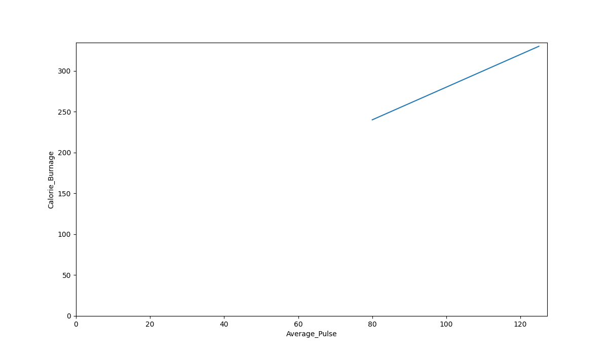
图形输出
正如我们所见,Average_Pulse 和 Calorie_Burnage 之间存在关系。 Calorie_Burnage 与 Average_Pulse 成比例增加。 这意味着我们可以使用 Average_Pulse 来预测 Calorie_Burnage。
为什么这条线没有完全画到 y 轴上?
原因是我们没有观察到 Average_Pulse 或 Calorie_Burnage 等于 0。 80 是 Average_Pulse 的第一次观察,240 是 Calorie_Burnage 的第一次观察。
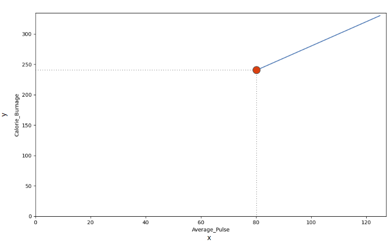
看线。 如果平均脉搏从 80 增加到 90,卡路里消耗会怎样?
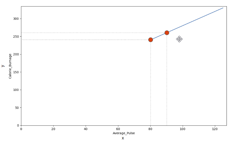
我们可以使用对角线找到预测卡路里消耗的数学函数。
事实证明:
- 如果平均脉搏为 80,则卡路里消耗为 240
- 如果平均脉搏为 90,则卡路里消耗为 260
- 如果平均脉搏为 100,则卡路里消耗为 280
有一个模式。 如果平均脉搏增加 10,卡路里消耗增加 20。