CSS 参考手册

CSS 参考手册 CSS 浏览器支持 CSS 选择器 CSS 函数 CSS 听觉 CSS Web 安全字体 CSS 动画相关属性 CSS 单位 CSS PX-EM 转换 CSS 颜色 CSS 颜色值 CSS 默认值 CSS 实体

CSS 属性

align-content align-items align-self all animation animation-delay animation-direction animation-duration animation-fill-mode animation-iteration-count animation-name animation-play-state animation-timing-function backface-visibility background background-attachment background-blend-mode background-clip background-color background-image background-origin background-position background-repeat background-size border border-bottom border-bottom-color border-bottom-left-radius border-bottom-right-radius border-bottom-style border-bottom-width border-collapse border-color border-image border-image-outset border-image-repeat border-image-slice border-image-source border-image-width border-left border-left-color border-left-style border-left-width border-radius border-right border-right-color border-right-style border-right-width border-spacing border-style border-top border-top-color border-top-left-radius border-top-right-radius border-top-style border-top-width border-width bottom box-decoration-break box-shadow box-sizing break-after break-before break-inside caption-side caret-color @charset clear clip clip-path color column-count column-fill column-gap column-rule column-rule-color column-rule-style column-rule-width column-span column-width columns content counter-increment counter-reset cursor direction display empty-cells filter flex flex-basis flex-direction flex-flow flex-grow flex-shrink flex-wrap float font @font-face font-family font-feature-settings font-kerning font-size font-size-adjust font-stretch font-style font-variant font-variant-caps font-weight grid grid-area grid-auto-columns grid-auto-flow grid-auto-rows grid-column grid-column-end grid-column-gap grid-column-start grid-gap grid-row grid-row-end grid-row-gap grid-row-start grid-template grid-template-areas grid-template-columns grid-template-rows hanging-punctuation height hyphens @import isolation justify-content @keyframes left letter-spacing line-height list-style list-style-image list-style-position list-style-type margin margin-bottom margin-left margin-right margin-top max-height max-width @media min-height min-width mix-blend-mode object-fit object-position opacity order outline outline-color outline-offset outline-style outline-width overflow overflow-x overflow-y padding padding-bottom padding-left padding-right padding-top page-break-after page-break-before page-break-inside perspective perspective-origin pointer-events position quotes resize right scroll-behavior tab-size table-layout text-align text-align-last text-decoration text-decoration-color text-decoration-line text-decoration-style text-indent text-justify text-overflow text-shadow text-transform top transform transform-origin transform-style transition transition-delay transition-duration transition-property transition-timing-function unicode-bidi user-select vertical-align visibility white-space width word-break word-spacing word-wrap writing-mode z-index


CSS radial-gradient() 函数

❮ CSS 函数参考手册

实例

带有均匀间隔色标的径向渐变:

#grad {
  background-image: radial-gradient(red, green, blue);
}
亲自试一试 »

下面有更多实例。


定义和用法

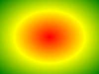
radius-gradient() 函数将径向渐变设置为背景图像。

径向渐变由其中心定义。

如需创建径向渐变,您必须定义至少两个色标。

径向渐变实例:

Radial gradient

版本: CSS3

浏览器支持

表中的数字表示支持该函数的第一个浏览器版本。

紧跟在 -webkit-, -moz- 或 -o- 前的数字为支持该前缀属性的第一个浏览器版本号。

函数
radial-gradient() 26.0
10.0 -webkit-
10.0 16.0
3.6 -moz-
6.1
5.1 -webkit-
12.1
11.6 -o-


语法

background-image: radial-gradient(shape size at position, start-color, ..., last-color);
描述
shape

定义渐变的形状。

可能的值:

  • ellipse(默认)
  • circle
size

定义渐变的尺寸。

可能的值:

  • farthest-corner(默认)
  • closest-side
  • closest-corner
  • farthest-side
position 定义渐变的位置。默认值是 "center"。
start-color, ..., last-color 色标是您要在其间呈现平滑过渡的颜色。该值由一个颜色值组成,其后是一个可选的停止位置(0% 到 100% 之间的百分比值,或沿渐变轴的长度值)。

更多实例

实例

具有不同色标间距的径向渐变:

#grad {
  background-image: radial-gradient(red 5%, green 15%, blue 60%);
}
亲自试一试 »

实例

圆形的径向渐变:

#grad {
  background-image: radial-gradient(circle, red, yellow, green);
}
亲自试一试 »

实例

使用不同 size 关键字的径向渐变:

#grad1 {
  background-image: radial-gradient(closest-side at 60% 55%, blue, green, yellow, black);
}

#grad2 {
  background-image: radial-gradient(farthest-side at 60% 55%, blue, green, yellow, black);
}
亲自试一试 »

相关页面

CSS 教程: CSS 渐变


❮ CSS 函数参考手册